An introduction of Taylor diagram
What is Taylor diagram?
Taylor diagram is invented by Karl E. Taylor for the comparison between model and observational data (Taylor, 2001). Essentially, it includes three metrics and their visualisation in a polar coordinate system.
Theoretical basis
- Pearson’s coefficient
- Standard Deviation (SD)
- centred RMSE (cRMSE)
These three metrics are related using a cosine rule: $$ c^2 = a^2 + b^2 + 2ab \cos(\theta)\ $$
$$ \text{cRMSE}^2 = \sigma_{\text{model}}^2 + \sigma_{\text{data}}^2 - 2 \sigma_{\text{model}} \sigma_{\text{data}} \cdot \rho $$
As definition, $\rho = \cos(\theta)$ and $\theta = \arccos(\rho)$
Visualisation in a polar coordinate system
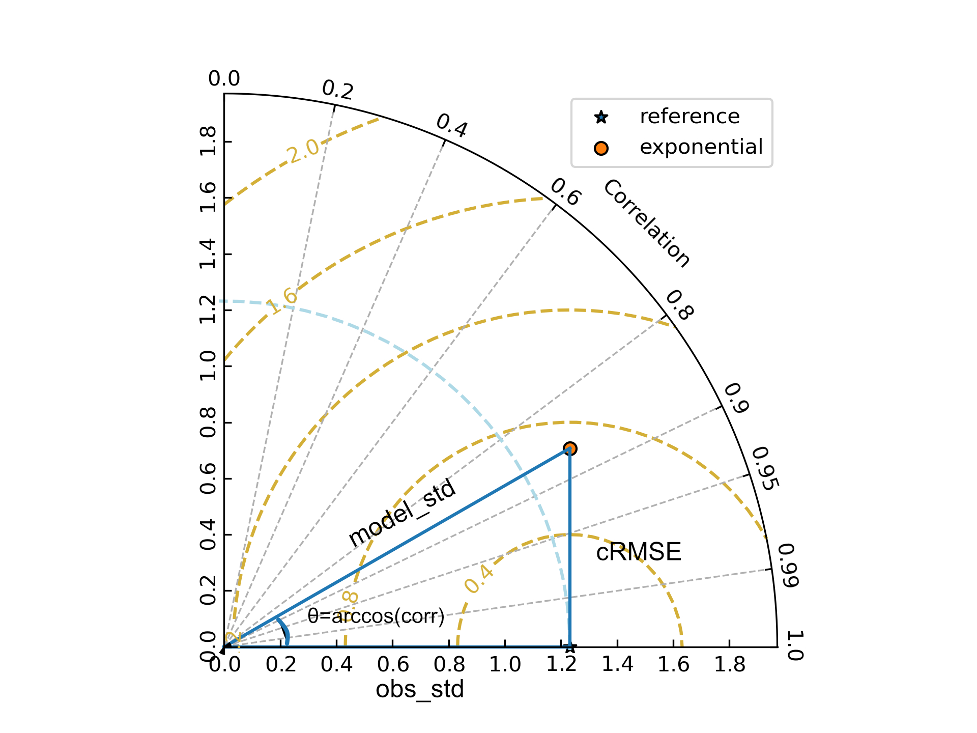
When we get the angle ($\theta$) and the radius ($\sigma$), we can plot a point in a polar coordinate system. In a more complex figure, we add the reference information such as its SD. Then the cRMSE that measures the model-data distance can be calculated.

cgeniepy package. The blue solid lines depict the core metrics and their relationship. Gold line is the cRMSE contour. Blue dashed line is the observational standard deviation. The correlation coefficient labels are the values of $\cos(\theta)$.
Interpretation of Taylor diagram
Clearly, cRMSE is the metric to focus on. A model with smaller cRMSE has better performance.
References
Taylor, K.E. (2001). Summarizing multiple aspects of model performance in a single diagram. J. Geophys. Res. 106: 7183–7192.